
The very concept of the Vertigo label
was inaugurated in Britain. As many record companies saw the
opportunity to reach a now larger and more discerning record buying
public, new labels were launched to cater for this audience. Listerners
had grown up, had more money to spend and were more open to ambitious
listening than they were some three years earlier. Some companies
dusted off
an already forgotten label, like EMI did with Regal Zonophone, or
moulded an already existing label into a new form, like Decca
did with Deram, and tried to fill it with new content. Other companies
came up with newly designed subsidiary labels. Pye had Dawn, EMI had
Harvest, RCA had Neon. Philips/Phonogram lifted the concept one rung
higher on the ladder of ambition by introducing Vertigo to the public
in the autumn of 1969. As they did so, they were pretty late already,
since the market for this kind of releases was now strongly dominated
by Harvest and Deram, and, of course, the independents Island and
Transatlantic. The main
initiator of
the label seems to have been Gerry Bron, a man most active in this kind
of venture. He later started the Bronze label. Another one would be
Tony
Reeves. They shared production duties on the first release.
We also received some information on the role of Olav Wyper, who by the time of Vertigo's inauguration was general manager of Philips records in Britain. We know that he was the one who signed Black Sabbath to the label. You can read (very concisely) about this in his liner notes for the Indian Summer album on RCA Neon. It seems that he at least contributed some significant strategies to Vertigo and could have been instrumental in setting up the label in the first place. Here is a quote from Olav Wyper from Still dizzy after all these years from 1998:
Although we set about restructuring the company, signing new bands and reworking existing artists and records with some success, we lacked the sort of dramatic impact that we needed. At the end of each day we would all gather in my office, have a glass or two of wine and discuss our progress. It was at one such informal discussion that the contemporary rock label concept of 'Vertigo' was born and just three months later we launched the label.
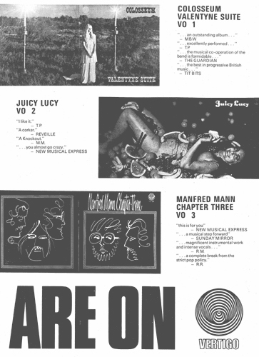
As was typical of the time, Vertigo signed a wide array of acts, which somehow seemed to relate to the vague notion of ''serious''. This included prog-rock, blues-rock, jazz-rock, rock-jazz (we'll come to the difference perhaps later), hard-rock, folk-rock, singer/songwriter, and some hardly classifiable music too. Almost no mainstream music was released in this period.
In the course of time, some catalogue numbers were left out. We have been able to trace most of these! Some were assigned to releases outside of the UK. You will find a link to the appropriate country alongside these numbers. Yet, a few are enigmatic still. We have just now received information that one of these omitted catalogue numbers was reserved for the British release of Oriental Sunshine's Dedicated to the bird we love (released in Norway only on Philips). If you know which number this was, please drop us a line!
We also received some information on the role of Olav Wyper, who by the time of Vertigo's inauguration was general manager of Philips records in Britain. We know that he was the one who signed Black Sabbath to the label. You can read (very concisely) about this in his liner notes for the Indian Summer album on RCA Neon. It seems that he at least contributed some significant strategies to Vertigo and could have been instrumental in setting up the label in the first place. Here is a quote from Olav Wyper from Still dizzy after all these years from 1998:
Although we set about restructuring the company, signing new bands and reworking existing artists and records with some success, we lacked the sort of dramatic impact that we needed. At the end of each day we would all gather in my office, have a glass or two of wine and discuss our progress. It was at one such informal discussion that the contemporary rock label concept of 'Vertigo' was born and just three months later we launched the label.
As was typical of the time, Vertigo signed a wide array of acts, which somehow seemed to relate to the vague notion of ''serious''. This included prog-rock, blues-rock, jazz-rock, rock-jazz (we'll come to the difference perhaps later), hard-rock, folk-rock, singer/songwriter, and some hardly classifiable music too. Almost no mainstream music was released in this period.
In the course of time, some catalogue numbers were left out. We have been able to trace most of these! Some were assigned to releases outside of the UK. You will find a link to the appropriate country alongside these numbers. Yet, a few are enigmatic still. We have just now received information that one of these omitted catalogue numbers was reserved for the British release of Oriental Sunshine's Dedicated to the bird we love (released in Norway only on Philips). If you know which number this was, please drop us a line!
 |
We found a page-wide advertisement that announces the label in International Times no.67, from the 6th of november 1969. |
 |
And another one in New Musical Express no.1193, from the 22nd of november 1969. |
These advertisements already show the
somewhat clumsy strategy to (often) release three albums at once, a
policy
that was adopted probably to reduce advertising costs, but that
ultimately only served to let many releases sink without leaving a
trace on the market.
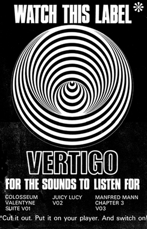
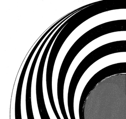
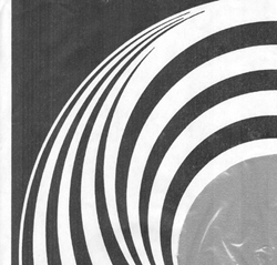
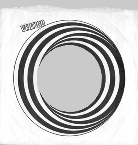
THE LOGO (see ads above)
As you can deduce
from the first ad, the logo was meant to have an effect on the
beholder. The ad invites you to cut the logo out, place it on your
turntable and look at it turning. Doing this indeed may produce a mild
effect of vertigo, at least if you are inclined so. The logo is very
cunningly designed: nine alternately black and white circles that
decrease in size and whose midpoints follow a straight line are
superimposed on each other. This again is repeated three times in ever
smaller size. The three circle groups are alternately placed upward (1
and 3) and downward (2). The relation of the three circle groups is
chosen so that the perimeter of the third lies on the midpoint of the
first - the second lies halfway. Sounds complicated, but is in fact
simplicity itself. This logo is one of record history's most
astonishing. A special font is used for the word ''vertigo'', located either below or above the spindle hole. This is in an
''outline''
font, quite neutral in itself, that is just too fanciful to be
business-like and too straight to be fantastic and thereby suited to
almost any style of cover design.
The latest article on the label in Record Collector 314 from september 2006 states Roger Dean as the designer. This seems quite improbable to us (though not impossible, of course), as it is very far removed from anything that ressembles his style of designing.
Attention! We have now certainty that it was not Roger Dean who designed the label logo (as we already expected). LINDA NICOL, née GLOVER, sent us a mail confirming her design. (She also designed the mosaic cover of the first Colosseum album on Fontana, the Magna Carta ''Seasons'' album, the Dulcimer album on Nepentha, and updated the information on some of the designers of the Vertigo covers and we have taken in that information where applicable). Hats off to Linda!
It should be clear from looking at the logo, that neither ''swirl'', nor ''spiral'', as the label is often called, are adequate. ''Spiral'' being a lot worse (there is no hint of a spiral anywhere), we choose ''swirl'', because the concept of a swirl may take any form (so why not that of the logo involved), while ''spiral'' evidently involves a line which, starting at the outside, gradually decreases the perimeter while describing a circle. Or the other way around, of course.
Diligent and knowledgable readers have pointed out a possible historic connection with some designs by Marcel Duchamps! A fine example of a ''forerunner'' of the logo can be seen here. And another over here. Pretty incredible, actually!
LP COVERS
A lot of
deliberation must have gone into the packaging. By now famous sleeve
designers such as Marcus Keef and Roger Dean were invited to enhance
the product with their designs. A fold-out cover was standard, many
releases had more than that. From additional posters, through die-cut
sleeves,
from lyrics inserts to gimmix covers, nothing was left untried. One
could with some justification take the point of view that the packaging
stood the test of time often better than the music did.
The covers used for the British releases are made of good sturdy board. The surface is not glossy, nor is it laminated, thus allowing time to cause quite some wear (especially edge-wear) throughout the years. The cover-designs are of clearly above average quality. The swirl logo along with the special word logo is featured on the front of every but two UK issues. The spine is printed with the familiar in-house style that sets label name, band name and album name between tiny solid squares. These are on the upper part of the spine. The catalogue number is on the lower part. ALL BRITISH RELEASES HAVE A GATEFOLD COVER, UNLESS OTHERWISE NOTED.
The covers used for the British releases are made of good sturdy board. The surface is not glossy, nor is it laminated, thus allowing time to cause quite some wear (especially edge-wear) throughout the years. The cover-designs are of clearly above average quality. The swirl logo along with the special word logo is featured on the front of every but two UK issues. The spine is printed with the familiar in-house style that sets label name, band name and album name between tiny solid squares. These are on the upper part of the spine. The catalogue number is on the lower part. ALL BRITISH RELEASES HAVE A GATEFOLD COVER, UNLESS OTHERWISE NOTED.
 |
 |
At
the back sleeve's top right corner the catalogue number is repeated.
The first few releases also show the ''old'' Phonogram number beneath
this. This changed in the course of time and we will come back to
this when applicable. |
LP INNER SLEEVES
Even the inner sleeve
was part of the design and showed once again the
logo minus the innermost swirl, this time in huge format, thereby
refraining from any
advertising with words. The middle of the logo was left open to let the
label of
the record peep through. The inner sleeves were lined with thin plastic
that was glued to the inner sleeve from the inside. The glue was
obviously of inferior quality: many inner sleeves have lost the plastic
liner.
 |
 |
There are inner sleeves where the surrounding border is white, as well as where it is black. This second variation is in fact a negative of the first one. We could not establish any understandable pattern as to where the white variation occurs and where the black one. The black variation seems to have been adopted after the white one, though. |
 |
Some regular
''white'' inner sleeves carry a printing code and some do not. The
captions have been spotted at both the right- and the left-hand bottom
corner. Examples are on the left. They are explained below. |
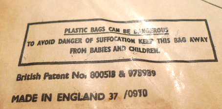 |
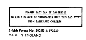
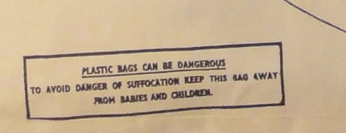
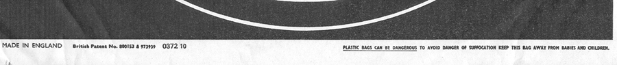
Most variations carry a reference to British patents and a warning against the misuse of the plastic inner bag. Left the white border variation, below the black border, which additionally carries a printing code that signified the printing date. In the example below it is 0372 10 (March 1972, 10th week). |
 |
Another variation spotted: no mentioning of any British patent, nor of any origin of manufacturing. It was found around a German (!) pressing of Catapilla's Changes. |
 |
|
LP
LABELS
 |
 |
A during this period quite popular concept
was used for the label itself: one side
showed the logo in large format, the other carried the information. The
information side had the logo repeated at the top, but upside-down. |
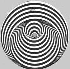
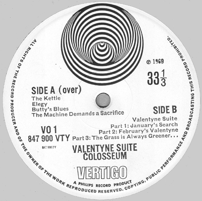
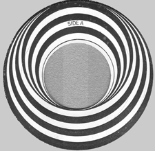
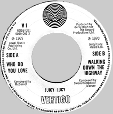
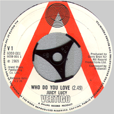
The font used on the perimeter text on the label B-side is very characteristic for the British releases from this particular time. As you would expect, font and general styling of the label were modernised as time went by. Where this is of any consequence it will be noted. There were also quite some small variations in the placement of the elements on the label, often even within the same release. We will only mention this when it seems consequential enough to do so. Almost every country where Vertigo swirl records were issued had its own font and design, although these sometimes only differ slightly from the British stylings. In Britain the year of release is shown at the right of the top logo. Below that we find the revolution speed 33 1/3 rpm (revolutions per minute). The perimeter text in capitals is as follows: All rights of the record producer and of the owner of the work reproduced reserved. Copying, public performance and broadcasting this record prohibited. And above this in the middle: A Philips record product. This reference to Philips is absent on later releases. Still later labels have the Vertigo wording moved to a location above the spindle hole and are sometimes referred to as 'small swirl'. That would mean three different swirl pressings for a record like VO4.
The A-side label has ''side A'' in capitals within the third white circle from above.
No one bothered to inform the Dutch branch about the B-side logo being meant to print upside-down, so they put the A-side logo on both sides, at least on early releases. Have a look at The Netherlands if you have difficulty following this.
LP
MATRIX NUMBERS
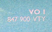
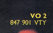
The matrix numbers in the run-out groove carried in the beginning "old" Phonogram numbers. At the rear of the sleeve this number is repeated onder the catalogue number (as shown above). It figures also twice on the label of side B, both times under the regular catalogue number. British Vertigo has the matrix stamped by a machine and NOT hand-etched. The Vertigo matrix numbers are - generally at least - set up as follows: catalogue number, side number (1 or 2, normally), a letter to designate albums, which should be ''Y'' in all cases, a dividing asterix or two slashes, the laquer disc sequence number, a dividing triangle, the country pressing code for the UK, being 420, and three numbers stating respectively the sequence numbers for the father disc (1 digit), the mother disc (1 digit) and the child disc (1 or 2 digits). As an example may serve the matrix number as found on our copy of the Gracious album (featured on the first UK album page). This reads as follows in the run-out grooves of the A-side : 6360002 1Y// 1▼420 1 1 4. The order of these elements is sometimes different. Ideally spoken all matrix numbers should follow above rules, but many do not. The amount of anomalies and errors in this field is surprisingly large. We will follow this trail along with the releases themselves.
LP
PROMOS and TESTPRESSINGS
We are quite sure that promo issues
exist, but we do not know in what aspects they differ from the 'normal'
releases. If you have one of these, please contact us! White label test
pressings and white label in-house releases are known to exist,
sometimes even with very strange
contents. Please refer to the last British album page (navigated to at
the
bottom of this page) to learn of a few of
these.
SINGLES
SLEEVES
Although Vertigo mainly was a label for albums, they actually released a lot of singles too. In Britain there was no big tradition of picture sleeves, so most of the British singles came in a company sleeve, a small version of, you guessed it, the album inner sleeve, this time with ''Vertigo'' at 11 o'clock and the swirl placed sideways. The logo was tilted awkwardly towards the centre. The top of the sleeve had a wave line-cut. Where we found picture sleeves, we will show them alongside the single in question. Some great picture sleeves are to be found on every page that concerns a continental European country.
SINGLES LABELS
 |
 |
As
you will probably already suspect, the labels of the singles are
strongly similar to those of the albums. The information for both sides
are concentrated on the B-side. As with the albums, the single labels
had some design changes in the course of time. We will show these when
they occur. |
There is, of course, a bewildering array
of variations in font style, placement and content of the information
on the label. Pressing year, composer credit and so on can wander all
over the label. We will only refer to this if it seems of substantial
importance. The first singles were issued with a plastic ''tri''
midpiece (not pictured here, but further below).
SINGLES MATRIX NUMBERS
The matrix numbers from the singles are
by and large similarly structured to those of the albums. Instead of
''Y'' (albums), you will find ''F'' (singles).
SINGLES DEMOS AND TEST PRESSINGS
Like every other company from this era,
Vertigo issued demos of most of their singles. These have different
labels to regular releases. The A side was (similar to other companies)
adorned with a large ''A'' in red print over a B-side design, which
listed the A-side track only.. The B-side had, of course, a B-side
design with B-side information. White label test pressings were made.
 |
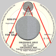 |
Again, the wording ''A Philips record product'' was deleted on later singles. The wording ''Vertigo'' was on later issues placed right under the top logo and the ''A'' was in an outline font rather than solid. The wording ''not for sale'' appeared on the left. |
CASSETTES
There are cassettes known of many
Vertigo albums, as well as a special sampler. Where a cassette release
has been confirmed, it will be listed among the albums. The covers of
the cassettes often do not show the whole album cover, but (restricted
by the small space available) only a small segment.
[Please note that if a record released in Britain was also released on Vertigo swirl in another country, we do NOT mention this fact along with the British record. You will have to look at the page for the country in question to find information about such a release.]
We sincerely hope that you will
be of assistance in making this information as reliable as possible.
In case of any contributions or questions or even complaints, please use this here virtual address: e-mail.
In case of any contributions or questions or even complaints, please use this here virtual address: e-mail.